
Email of Consent

We sent an email to NAO's publicist asking for permission to use her song for our educational music video. we did this so we would not get copyrighted on youtube.
Evidence of work


This shows evidence of us working together on the blog. On the blog we conducted the planning, research, feedback and construction for our coursework.


Group Reflection
As a group we worked extremely well together. From the start we divided the tasks up between us and played on eachother a strengths in order to achieve the highest grades, for example Anneka had good editing experience and therefore she had the task to edit our video.
At the start of each lesson we would set out between us what we wanted to accomplish and what task we would each individually be working on, this really helped to create progress.
At the start of each lesson we would set out between us what we wanted to accomplish and what task we would each individually be working on, this really helped to create progress.
Final Website
We wanted Nova's website to link well with her personality, for example every page has bright colours and images.

This the home page, we added a simple navigation bar at the top of the page which allows users to enter any page they wish. On this page there is a snippet of the Nova music video playing in the background.

This is the Bio page which includes lots of interesting information about Nova for fans to get to know her better.


The Shop page has all the merchandise currently available to the public, the merchandise includes t-shirts, phone cases, a backpack, a poster and a cap.


Digipak final feedback
Here is the feedback we received from our class, analysing our digipak...
+ "The images used on the digipak show the personality of the artist"
+ "The didpak suits the genre of music that are making a music video for and also fits in well with imagery they used in the video itself"
+ "Nice continuing colour scheme with good matching photos"
+ "Colours all link well and the pictures are good quality"
+ "The colours and everything go together, nothing really to improve"
+ " Using the lights link with the artist image entirely and makes them look edgy. All the colours are vibrant and shows the artist in positive light. The use of the collage also gives the audience an insight into what the video will show and gives a mysterious vibe. Genre looks pop"
+ " Its quite an anaesthetically pleasing digipak to look at. The text theme and colour creates a mood and goes with the genre.
+ "Really like the bright colours, makes it stand out"
+ "The synergy matches the use of lights"
- "some photos are dark in quality and oversaturated"
- "maybe change the top right one to a picture instead of a collage"
- " Top right could be improved i think its too much to have on there"
- "Some images in top right look squashed might look better if they were more square"
- " The white bit behind the track names is a bit of an eyesore"
Song name development
When developing the ideas of the song names, we had to keep in mind that Nova is slightly abstract and unconventional, which reflects in the other cross media conventions and should do in the album too. With the help if this website: http://blog.sonicbids.com/8-strategies-for-naming-a-song-with-no-obvious-title , researching the song names of other artists of a similar genre and our own creativity, we were able to think of appropriate names to form a cohesive album which is relevant to Nova. We also took some inspiration from film names such as 'neon demon', as the title reflects Nova's weird but wonderful style which carries hues of darkness and deep song lyrics.
Reasons for choosing font
To help build up Nova's bold brand image, we decided that it is very important to have a specific font, used for the logo and other things such as the alum cover, website and digipack, which fans will be able to recognise on it own, without even seeing it relating to a photo of Nova. We pondered on a few different fonts that were either in cursive or bold text, but we all decided that the font, 'Desdemona' suited our brand image best. This is because it is bold and recognisable to fans, yet also looks fun and slightly girly like Nova herself. Paired with a baby lilac colour, it creates the perfect logo for Nova's brand image.
Artists who inspire Nova's image
Nova's style and image has been inspired by different elements of female singers, whether that be their appearance, stage presence or genre of music. Here are a few examples of female artists who have moulded and inspired Nova as a pop star:
Nova is inspired by Nao's beautiful aesthetic across all media platforms as the synergy is very cohesive and bold. She uses bright solid colours like in the above pictures along with iconic hairstyles. She comes across as free spirited and confident which is one of the reasons why she has a great fan base.
SZA, similar to the other artists, has a very noticable, strong identity, who loves her music. She is seen as a pop/R&B star and is adored by many, but she also comes across as down to earth and relatable, which is what we aimed to do for Nova. SZA is also a newly discovered artist who is creating a very string fan base and is building up her fame very quickly.
- Jorja Smith


- NAO


Nova is inspired by Nao's beautiful aesthetic across all media platforms as the synergy is very cohesive and bold. She uses bright solid colours like in the above pictures along with iconic hairstyles. She comes across as free spirited and confident which is one of the reasons why she has a great fan base.
- SZA


SZA, similar to the other artists, has a very noticable, strong identity, who loves her music. She is seen as a pop/R&B star and is adored by many, but she also comes across as down to earth and relatable, which is what we aimed to do for Nova. SZA is also a newly discovered artist who is creating a very string fan base and is building up her fame very quickly.
- FKA Twigs


Alternative magazine covers
For the magazine cover, we decided that we wanted to do a 'Paper Magazine' spread because it is very well known for being artistic and modern, inviting all important and famous celebrities for being on their covers. However, as an alternative outcome for our magazine, we could have chosen a more music related brand such as: Billboard, Rolling Stone, Clash or Vibe. Even though we believe that our cover looks accurate and was successful, possibly we could have chosen a more 'interesting' magazine company to showcase our artist, as the Paper Magazine traditionally chooses a more simplistic design.
Examples of alternative magazines:


Examples of alternative magazines:


Shortlisting Album Cover Photo
When deciding on a photo to choose for the album cover, we had to consider what photo would capture the essence of both the music video and the genre/style of the artist herself. Before we decided on the final photograph, we picked a few photos that we thought could make a good cover and representation of her music. However, we ended up choosing a photograph of Nova with purple lighting in the background, with the same multi-coloured lights wrapped around her that were used in the video, sitting on the floor. The photos below show a few of the different looks that Nova is flaunting in the video, however, we did not think that they were strong enough to be the album cover.
Shortlisted Photos:


Photo used for album cover:

Final digipak feedback
We received mainly positive feedback from our classmates about our digipack, however there was some slight critism about the top right hand corner. Here are some examples of what the feedback consisted of:
Using the lights links with the artist image entirely and makes them look edgy. All the colours are vibrant and shows the artist in a positive light. The use of the collage also gives the audience an insight into what the video will show and gives a mysterious vibe. Genre looks Pop. Maybe remove the middle band as this will be folded.
AMAZING
colours all link well and the pictures are good
Looks really good. Top right could be improved I think its too much to have on there.
The colours and everything go together Nothing really to improve
Purple tint over all the pictures is nice, maybe change the top right to one picture not a collage
really like the bright colors, makes it stand out, some images in top right look squashed might look better if they were more square. The synergy matches the use of lights
photoshoot inspiration
I came across this photo on social media of a pop star called 'Solange' of a photoshoot for 'Glamour Magazine'. When I saw this, it made me think of the type of image I see Nova as, and aspires to be like aesthetically and it inspired some of the glittery outfits and fluorescent lights used throughout.


Problems we overcame when filming
During filming, surprisingly most of it went smoothly and without many problems, but there were a few that we encountered which we had to either improve then and there, or later on when editing or re-filming. Such as:
- Lighting in the bathroom: In the bathroom shots, the lighting is dark and the only source of light are the glow sticks, fairy lights and the neon balloons. This however sometimes looked grainy which made the quality of the video look poor and unprofessional. To fix this, while filming we looked over our footage and used our phone torch lights behind the glowsticks to create a soft light on Nova's face, which made the video look a much better quality.
- Forgetting words: Sometimes, when filming, Charlotte would forget the song lyrics when lip-synching for the video which would sometimes look strange. To fix this, because there was no sound in the clip (as the music was going to be layered over the top), one of the other members of the group would shout the song lyrics before it was time to mime them. This worked very successfully as it meant that the video looked more realistic and professional.
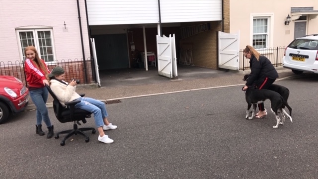
- 360 degree shot: When filming on the road with the wheely chair and the dogs, we found that as Holly was filming the 360 shot, the bumpy road meant that the shot looked wobbly and sometimes out of focus. We tried holding the camera more steady but it did not do much to improve the shot, so when editing, Anneka managed to find a 'stabilizer' effect to add to the shot to make it appear a lot smoother.
Website feedback - first draft
Feedback from first website draft
People in our class asked to evaluate the pros and cons of the Nova website:
+ Love the videos in the background of the homepage.
+ The transitions are really interesting
+ Clear synergy and colour scheme
+ Original use of video on home page
+ Matches artist image
+ Like the original layout of the gallery keeps the page interesting.
+ I like the effect used when you open a new subsection
+ Good variety of background images
- Gallery does not allow you click and enlarge the image
- Image under video tab seems poor quality
- Should the social media links be added to the 'connect' page.
- In the shop section, when a product is added to your cart it gives the user a zoomed image of the item.
With this feedback we will make these changes to the website.
Filming techniques
In order to create the desired effect that we wanted for our music video (sleek and polished), we had to research into how to do some of the shots which we were aiming to recreate.
One shot which we wanted to implement in our music video was the 360 shot. This type of shot is one which tracks around one singular spot in a full circle (example below).

In order to recreate this type of shot, we put the person filming (Holly) in a desk chair, whilst Anneka spun Holly around Nova as she filmed her circumference.
The creation of this is exemplified in the image below.
Another technique which we used was low light filming. We used this in order to create the purple hue in the bath scenes. Using low light additionally made the camera focus more on glow sticks and neon balloons, which was the desired look that we were aiming for.

Here is an image of what the bath scenes would have looked like if they were filmed well lit with flash or additional lighting, instead of low light. As seen in the image, the bathroom does not have the same purple hue and the light up balloons and glow sticks look dull and washed out.
Whereas in this screen grab taken from the video where we did not use any additional lighting (and if we did, it was on a very low light), the whole scenery has the desired purple hue and the glow sticks stand out compared to the darker background.
The camera we used was the Canon 650D. This camera is of high quality and allowed us to make the most of our filming and our filming techniques.
Social Media inspiration
On Nova's social media accounts, she is portrayed as a bubbly and fun celebrity who interacts with her fans. We decided to create this persona for Nova as she is a new artist who requires fan support in order to expand her brand and self.
An artist that we gathered this friendly, interactive persona from is Jhene Aiko. Jhene is a singer who is known to interact with her fans over twitter.
An example of this is in the screenshot below:

Despite her fame and success, she as always remained humble and ensures to reply to her fans. This is something which we administered on Nova's twitter:

In the image above, Nova is seen tweeting her fans and writing tweets addressed to just her fans, similarly to Jhene.
Location Analysis
In our video, we wanted the emphasis to be solely on Nova, as it was a performance video. We wanted the locations to be minimalistic and simple, in order to remain the audience's focus on Nova herself, and not the backgrounds and locations.
Our five locations were:


Our five locations were:
- outdoor in front of foliage

- Bathtub


- Indoor conservatory on sofa

- Outdoor in residential street

- In front of fairy lights

As you can see in these screenshots, Nova is the main emphasis of each as they all have plain backgrounds, which make her and her outfits stand out considerably.
Editing Techniques
Before we begun the editing process for our music video for Nova, we all established that we wanted the final product to be very slick with fast paced cuts and a use of different effects throughout.
In order to learn this, the person in charge of editing (Anneka) had to research and learn the techniques for this desired outcome. Anneka watched YouTube tutorials for her preferred learning style.
Above is a video which Anneka learned some effects to implement into the music video. From this YouTube video, Anneka used the mirror/ reflection effect (mirror), and the colour hue change (colour balance HLS). The mirror effect was used variously throughout the video, and colour balance HLS was used within the latter part of the video.
Secondly, an effect which was used majorly throughout the video was Warp Stabiliser. As within the filming process we did not use a tri-pod and it was mainly hand held filming, some shots were inevitably shakier than we had preferred. Anneka researched into methods of smoothing out the shaky footage, then learned how to use warp stabiliser. This effect is used on almost all of our shots in the music video.
However, it was then discovered that once warp stabiliser had been added onto a clip, you could not change the speed. Anneka research found that if 'nest' was added onto the clips, it allowed the videos speed to be changed also.
Another major effect which was used in the music video was the use of zooming in and out on clips desirably. This was particularly predominant within the latter section of the video, of which the outdoor dancing shots are quickly zoomed in and out on the beat of the music. Anneka used this video to learn this editing trick, of which she successfully applied to the video.
Tour poster 2

This is another tour poster we designed for Nova. This poster shows our colour theme which is purple, the main background image was a photograph taken of a sparkly pink bottle which was used as a prop, it also featured in our photo shoot. The design is a simple layout with Nova's name and album name in big bold font which is easy to read and eye-catching. We used the same font for all texts as it shows clear links to our other media products such as the website. One improvement we could make to the tour poster would be to make the size and colour of the texts more obvious to be see as it can be quite difficult to read the text. We also incorporated an image of Nova onto the poster so she can be recognised instantly by her fans, this image can also be seen in the music video which helps to create synergy.
Tour Dates poster

We designed a simple poster for Nova with the aim that it would be effective and eye-catching. We used the same font throughout the poster which can also be seen throughout our other media products. The difficulty we faced when designing the poster was that the background picture is dark in quality so it can be hard to clearly see the white writing.
When creating the poster we did take in ideas and concepts from our inspiration posters such as Ellie Goulding's tour poster .......


We took inspiration from the layout of the tour dates especially how the month and year was in bold we then used a similar template using the date above the venue.
We took inspiration from the layout of the tour dates especially how the month and year was in bold we then used a similar template using the date above the venue.
Tour Dates poster inspiration

The above two images show tour dates poster for Ellie Goulding and Little Mix.
Ellie Goulding is the main image of the tour poster creating the star image and a recognisable image for her fans and viewers of the poster. Her name is featured at the top of the poster in a large easy to read font. The template is simple and clearly states the dates and venues of her tour which makes it easy for an audience easy to interpret. The theme of the poster is focused on her but also portrays a colour theme of pink/purple which shows synergy across her media products.
For Nova's tour poster, we will incorporate some of the concepts Ellie Goulding has used such as using an image of Nova as the background and making sure the size and font of the text is clear to read.
Little Mix has also used a simple layout for their tour date poster. The use of bright bold colours such as the blue, pink and yellow are eye-catching and help draw attention to the poster. The name 'Little Mix' is also bold and recognisable to an audience. The list of tour dates and venues is well represented and portrayed. At the bottom of the poster it also features the day and time the tickets will be coming on sale which is very useful and helpful to those wanting to purchase tickets.
Digipak album poster

This is our Digipack album poster which will be used to advertise Nova's album "Nobody Better". It will be used in music stores such as HMV to attract customers who are already looking to purchase music related products.
The design of the poster is quite simple using the main image of Nova to create the 'star image'. We have used the colour theme of purple which helps to create synergy across our media products. We have also used the same font text which is used on our website, digipak and magazine cover to create parallels between the products and create a recognisable image for Nova. Following our inspiration from Rihanna's poster we decided to also include the actual image of our album cover and include the names of two singles featuring on the album, in order to create excitement around the new album as fans may have already heard Nova's single and are intrigued to hear more.


Here you can see the poster we designed for Nova's album and our inspiration from Rihanna's album poster. Its clear to see that we used a similar layout as we felt the template was clear to interpret, we also liked how Rihanna had incorporated her red theme and decided to do the same using our purple theme helping to create synergy with our media products.
Subscribe to:
Posts (Atom)
-
 Here is our first draft of Nova's Tour date poster for her album 'Nobody Better'. We used the background image as Nova as this...
 -
Before we begun the editing process for our music video for Nova, we all established that we wanted the final product to be very slick with ...
-
Feedback from first website draft People in our class asked to evaluate the pros and cons of the Nova website: + Love the videos in t...
